Saturday, September 14, 2013

Kitchen and Cabinetry Progress

Feb 8-11

We regularly visit the unit during the kitchen and cabinet construction stage so that we can monitor the progress and make sure all the details that we've discussed will be covered.

Here's the kitchen:

The base of the kitchen is marine plywood. According to our contractor, it is a very sturdy material, and as its name suggests, it is water resistant so it can be used in the kitchen and also bathroom cabinets.
A marble counter top will be placed here afterwards. 
Now I want to share with you this requirement when you're living in a condo: the grease trap. It's placed under the kitchen sink so that the water will be filtered first before going down to the main drainage of the condominium. It costs around 5,000 and you have to clean it monthly. We were able to find a good deal in one of the condo's workers. They could also clean the grease trap for you for 500.00. And I think it is better to ask someone to clean this because it will get very very smelly. 


This is the audiovisual cabinet. It uses the same material as with the kitchen. At first, we didn't have plans of putting an audiovisual cabinet, but we figured that it would look better if the cabinet in the kitchen and living room would be consistent.

Here's the cabinet for the masters bedroom. This is quite difficult to decide on because the space is very limited. As you can see in the picture, the cabinet almost touches the bed. The space where you can walk gets very narrow. Unfortunately, due to limited space, this is the only option that we have since we asked for as many cabinets as possible. The doors of the cabinets need to be sliding doors to so that it would open.

Aside from the little cabinets below the window, we also have this main cabinet that we could use to hang our clothes. To maximize the space, we had to do use the corner space although it would be a little difficult to place clothes on the innermost part. We decided to have three compartments for the main cabinet, the bottom would be mine, the middle will be The Daddy's and the topmost will be the space for other stuff such as bed sheet and blanket. We also left an open space above the cabinet. It will be the space for luggage bags and mattress for visitors. :)

For the color, we chose to just have these varnished so that the natural wood design would still come out. For the Masters Bedroom, we chose a lighter shade so the marine plywood still needs to be bleached. We chose lighter shade because the flooring is already darker. While in the common area, the flooring is lighter so the cabinet for the kitchen and AVR would be darker. 


There are so many details that we still need to attend to after this, such as cabinet handles, tiles for the splash board in the kitchen, proper placement of cabinet so it won't cover the plugs that we have customized for the initial kitchen design that we in mind and also some design that would add to the appearance. I'm so happy that we're still part of this little details and that we get to really choose what we like :)

Tuesday, March 12, 2013

Project: Picture Wall

Materials: 
Scrap woods from construction (pics to follow)
Nails
Sandpaper
Varnish or Paint (leftovers from construction)
Cardboard
Plastic Cover
Printer
Photo Paper
A little bit of Photoshop/Paint/Google Picasa/MS Powerpoint


While monitoring the construction progress, I'm seeing scraps of thin woods (pics to follow) that could not be used anymore. I'm thinking that they would make a very good picture frame. Lots of them. And since we have lots of pictures together because of our travels and plain vanity, this project crossed my mind.

The contractors also left spare paints and varnish and I could use them for this project. :) All I need is a good printer for this. I know there are useful and affordable printers (even second hand) out there.

We have this wall in the masters bedroom (pics to follow) and that is the perfect place for these picture frames. I already asked Kuya Cabs to add shelves on that wall where I can place these. I'm going to start collecting our best pictures since our very first travel together which is during our first anniversary last 2007 in Los BaƱos (I'm not sure though if I still have those). And hopefully I'll find some old and payat pics when we were in college.


Excited to do this! :)


Sunday, February 17, 2013

Kitchen start off

Feb 3, 2013

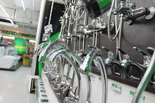
Later that day, we met with Kuya to buy essential kitchen fixtures already. We just went to a nearby Wilcon (jeep away).

Here's the selection of sink. (And The Daddy's back)

It's a good thing that you bring along with you your architect and contractor so you would be sure about the measurements of the things that you'll buy.


 We also need to buy a faucet but before that we have to check out the water purifier first because they should be compatible.

Water purifier: The Daddy thought of buying a water purifier instead of ordering drinking water every now and then. Aside from that, it will look more good on the kitchen instead of a bulky water container. (Arte lang:)) I'll post a separate entry about water purifiers because I really learned a lot during our countless inquiries in all water purifier outlets in Manila. :) 

 After purchasing the water purifier, we had the appropriate measurement already for the faucet. But first Kuya measured the height of the faucet so that it wouldn't touch the cabinets above it.

Then we measure the water purifier's adopter and see to it that it would perfectly fit the faucet that we will buy.


So we now have the kitchen sink and faucet. Plus water purifier to start off the kitchen. According to Kuya, the sink is really needed to start off because they have to trace the kitchen top and prepare a spot for the sink.


 This is the actual location of the sink:


Before the day ends, Kuya got more measurements of the cabinets that he will do:

 Kitchen
 Kitchen
 Audio Visual

Audio Visual. Thinking of what we can do with excess vinyls. :D

 And the master's cabinets.


Complete with colors

February 3, 2013

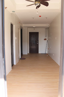
The architects already packed up and cleaned the unit as well. So here is the picture of a clean and bare unit:

 View from the front door.

View from the balcony.


Remembering how it looks before (October 2012):


How time flies for our dear baby:)

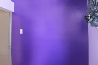
Anyway, here's the purple-is-the-color-of-royalty office

The Daddy will definitely feel like a king when he's working here. ;)

Here\s the gray accent wall.
 I had uncertainties before when we agreed to use gray in one of the walls. I thought that it will look boring and will just look like an ordinary cement wall. But I'm so wrong. It looks good, different and stylish! I hope there are still other walls in our unit so we could have more gray walls!

 But this one will still be my favorite wall. The blue accent in the masters bedroom. This is also the reason why I don't want any other design or accessories here, just that blue wall.


So you've seen all the parts of our home. Initially we just want to use Earth colors. But I think adding blue and purple to it makes it more interesting and different. So far, I love it! I hope it blends well with the furniture and other future additions. :)

Lights and Plugs

Jan 31, 2013

Our architects texted us, informing us that they have installed the lighting fixtures that we bought already. And because we cannot wait, we visited the unit immediately.

 1. The entrance light and the 2. open space light (my favorite lighting fixture)

Here is another picture of the open space light. It uses warm light which makes it really cozy. I think it will really feel relaxing if this is the only light that will be left open while we're on the living room. :)

Well there's a CR fixture too. Wow.  

 This is the masters bedroom light. It uses pure white lighting. But I guess we wouldn't be using this too much because we might have lamps on our side tables. And we'll be using warm/yellow light for that which is really really conducive for sleeping. :)

 These are the dimmable drop lights aka show-off lights! Haha. Again, we might not have to use this that often. It is more of a design or accent to the ceiling. 


We bought this cute little LED light which will be used when we're sleeping. We used this to try all the outlets to see if they are working so we can already identify any problems. Fortunately, all of them are working. :)

So now, the contract for architect is close to finish. They just have some minor punch list to complete. The kitchen and cabinetry can start very soon.

Construction Progress Part 2. Almost done!

January 30 - we can now check the unit even during the evening because they finally installed the lights!

Aside from just checking the progress, we went today with Kuya Cabinet (our contractor for kitchen and cabinet) so he can also check the current status of the unit.


They finished the common area flooring already! We actually like it. :) 


Close up shot:

This is actually what I thought of before so I'm happy that it came out like this despite not seeing it's actual sample during our CW home depot trip before. 

Anyway, the most common flooring for the common area is still ceramic tiles but since we like a wood-like design, we went for Vinyl tiles. 

The sliding doors are also attached:


For The Daddy's office, the sliding door is exposed inside the room. But for the Masters bedroom, we chose to have pocket doors - or those that have space for the door to slide inside so that it won't be exposed in the room. This is more expensive because they will use more materials for this but this is more convenient for us because we don't want the door to be bothering the bedroom fixtures that we plan to place on that side of the room. 

Anyway, we started discussing some kitchen and cabinet details with Kuya:


He also showed us some samples or swatches for the kitchen countertop and the shower enclosure.

Kuya's quotation to us includes the granite material already for the countertop but the budgetary that he provided only fits these designs. But we like the black countertop already, so no need to ask for the more expensive designs to have more options. I'm actually looking forward to that black kitchen counter top. I think it will look really modern and stylish. But I have to balance it with a brown and wood-like cabinetry to still stick to the theme.

These are the choices for the shower enclosure. We chose the one in the middle because it's not that clear and not that plain either.  

These are Kuya's design for our approval.

 And today we also paid downpayment so he could already start mobilizing for the kitchen and cabinetry.

Yipee!


Friday, February 1, 2013

Sale fanatics

We went to the mall to just grab some food and stay for a while and we were greeted by another Homeworld sale!

And since we're crazy about sales, we decided to check the items out and went home with these:


Four pillows @ 175.00 each. This is the cheapest already because it is the SM brand pillows but still the same quality as with more expensive pillows (I hope!)


We also bought 4 throw pillows plus their pillowcase and curtains. I forgot their prices but I'm sure they are not that expensive :)

And since I think I have real readers now, let me give you a touch of instagram in this post. Say hi to our soup in a bread merienda for this day:


More construction progress posts after this! :)